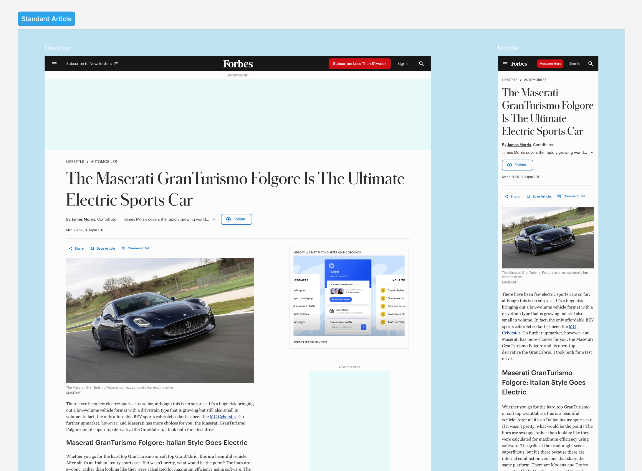
The simple elegance of the redesigned Forbes article page belies the months of UX research and testing that went into it.
Forbes
Role: Design Director
Team: Myself, Lead Experience Designer, 2 Designers, Product Owner, Engineering Manager, Lead Developer, 3 Engineers
Tech: Figma, React, TypeScript, Storybook, Sass/CSS, React Testing Library

The simple elegance of the redesigned Forbes article page belies the months of UX research and testing that went into it.
As a leader of a large, cross-functional team, I drove the creation, testing, and implementation of reusable components for Forbes’ standard article page, where 150M+ monthly visitors consume content on the platform.
Mentoring designers to consider system priorities alongside craft, I increased their confidence in contributing to the design system, expanded its capabilities, and reduced review cycles by 30%.
Together we produced an elegant, performant article page that supported a 40% lift to conversion and increased user engagement with high-intent actions.
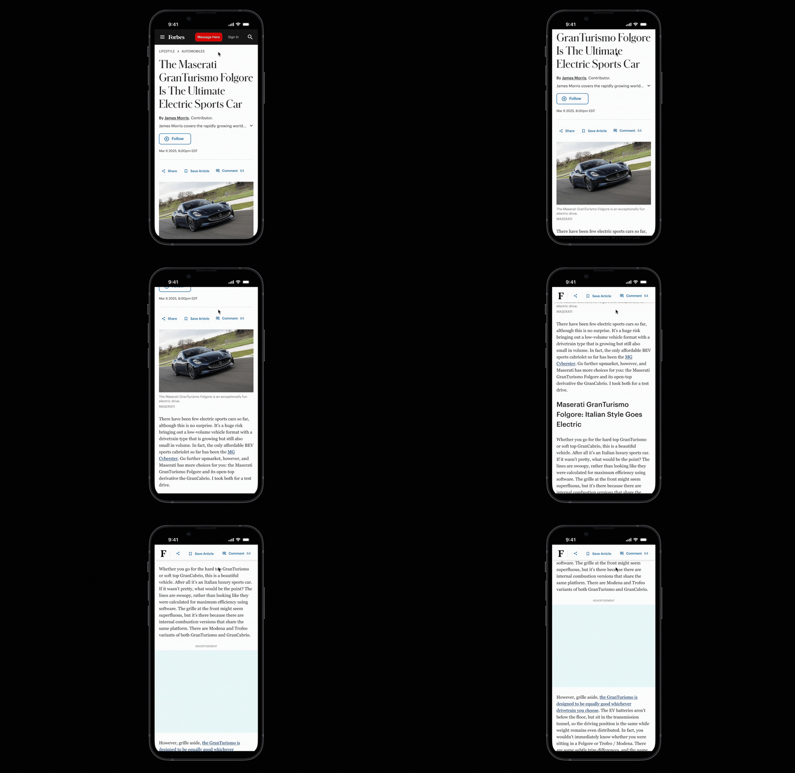
Prototype: The engagement nav sticks on scroll to afford user access to high-intent actions. Lowering the interaction cost of conversion features provided signifcant lift to KPIs.
Forbes publishes content on half a dozen different article templates. In 2023, we decided to redesign this product, centralizing and standardizing its design, while migrating its tech to our React component library, which is powered by our design system.
We also made numerous improvements to the user experience, resolving headwinds caused by inconsistency, and promoting conversion-focused features.
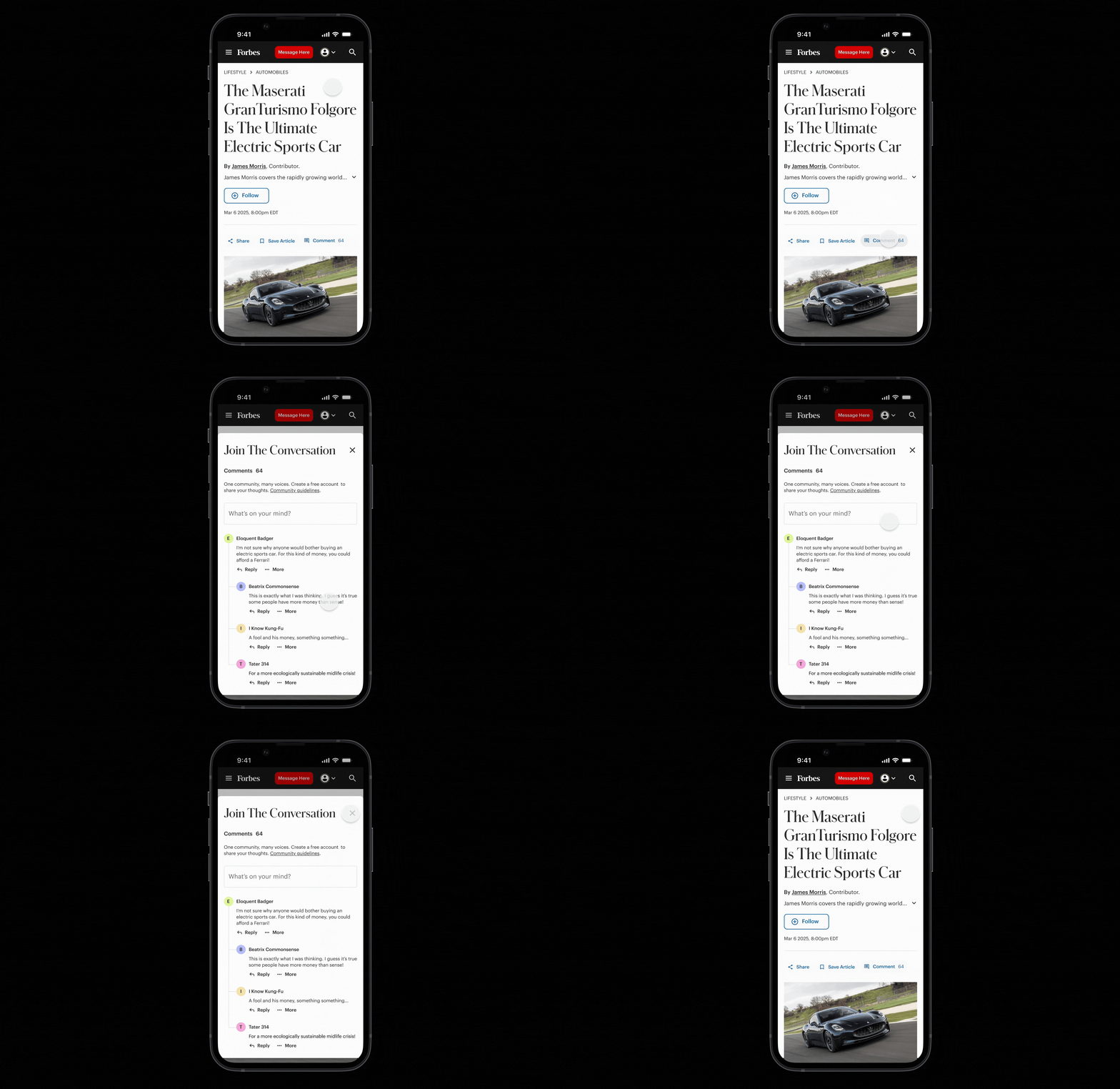
Prototype: The commenting experience opens in a drawer. Commenting is one of several features in the article product that involves a third-party integration. Implementing UX improvements like the drawer thus required additional layers of management and coordination.
This project had a large team behind it. I was one of two design leads, and managed component authoring and integration. I partnered with the other design lead to improve the UX of the page itself, and two other designers contributed in production roles. There was also a product owner, an engineering manager, a lead developer, and a pod of 3 engineers who worked on third-party integrations, ads, and components.
My strategic contributions built on my previous work migrating other critical site templates to our design system and React component library. I also partnered with product and engineering leads to scope the project based on a combination of user and business needs.
In the day-to-day, I reviewed design work and drove cross-functional alignment between design artifacts and components in the codebase. I also created documentation to level-set the logic and UI expectations for each component, and made design decisions informed by A/B testing data.
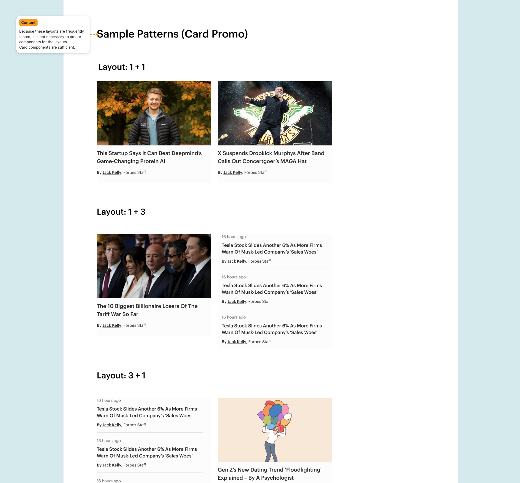
We A/B tested many features along the way, such these card layouts, which targeted session length by serving articles based on a user's history. In this case the data pointed us in another direction, but the rework was minimal since the layouts were based on existing components.
Web Vitals data informed a lot of the problems that the team sought out to solve, and the migration process itself drew heavily on learnings from previous migrations, which I had led on the design side. Due to the importance of the product to the company’s business, and the number of stakeholders—editorial, engineering, product, design, revenue—the team conducted 5-6 sprints worth of discovery to clarify the project’s goals.
Tactically, we saved some time by aligning on what components could be deployed as-is, and which needed additional refinement to meet project goals. CI/CD pipelines with bucketing allowed us to A/B test solutions dynamically.
Legacy article templates were siloed. Each of the half-dozen page types had been considered on their own at creation, which lead to inconsistent user experience. There were often business reasons for this, and a lot of the UX heavy lifting involved recognizing and ameliorating various business cases, predominantly around ad placement and the promotion of paid program content.
Third-party integrations on the page added complexity. For example, updating the commenting experience took extra work because we had to submit changes via a form and work asynchronously with an external dev team. Although closer collaboration would have been ideal, the level of detail required of this method allowed us to produce meticulous documentation.
About 70% of the way through the migration, the company decided to replace a vendor for the product, which required the team to pivot to a homegrown solution, then pivot again to excluding the feature entirely.
Aside from adjustments to layout and headings, and replacing legacy architecture with reusable components, the team made a handful of changes that showed immediate impact to engagement and conversion on the page.
We implemented full-width headlines on desktop to better orient the reader and establish intention. Previously, headlines on some page types had been interrupted by a video unit. This was placed below the headline to maintain viewability while mitigating disruption to the reader experience as evidenced by reduction in bounce rate.
Recirculation units programmatically drive traffic to content based on user interests. Previously these units had disparate styling and logic, because they evolved out of tests on the page. With this project, we settled on the most performant presentation and standardized it, benefitting session length.
Previously, user actions important to conversion were located at the top of the article. We reduced the interaction cost of these actions by introducing an engagement nav that pins to the top of the page as the user scrolls. Providing persistent access to these controls improved conversion.
We standardized a paid program article to load on scroll after the end of the original article on the page, replacing legacy promotional units to increase session length.
Introducing the engagement nav increased user activity with the “save” and “comment” actions by more than 50%. Because these actions require an account to complete, we saw a commensurate uptick in registration, contributing toward a 40% site wide increase in conversion.
Placing an entry from the company’s paid programming catalogue at the bottom of each article page greatly increased the exposure of that content and provided additional value to paid programming clients. This also improved session length and time on site.
Migrating the various article types to a single system delivered a lot of efficiency, cutting development and iteration times, making the site more modular and maintainable, and establishing stronger guardrails for quality.
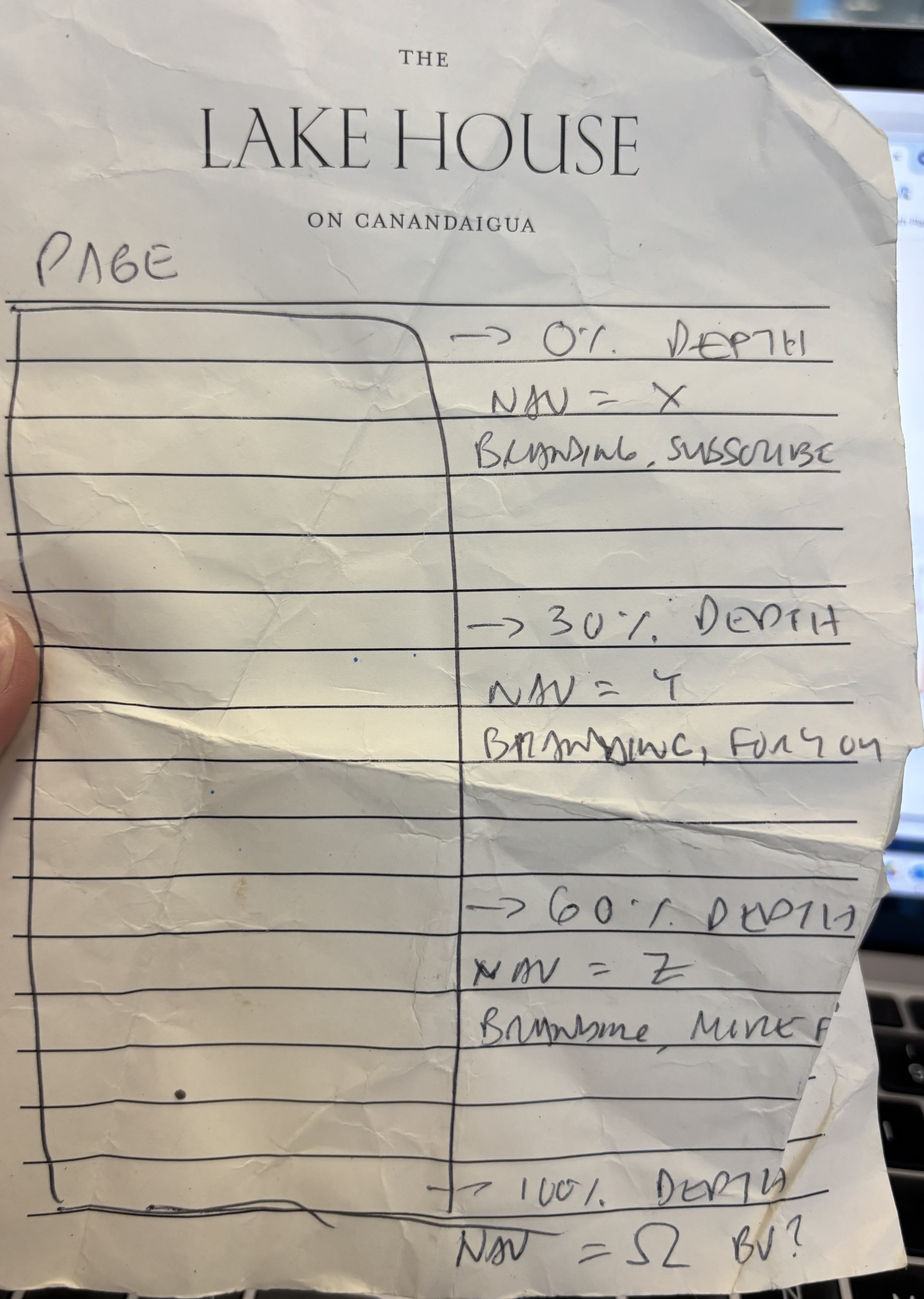
This is a photo of my hand-drawn sketch of the feature that became the engagement nav, proposing changes to the experience as the user scrolls down the article page.
This project validated processes that I had established in prior migrations and proved them applicable to larger teams. Both the process and its output showed elegance at scale, which was satisfying.
I developed as a people manager over the course of this project, learning how to better support designers working autonomously, while holding their work accountable to existing standards. I also had to communicate changes in the standard to cross-functional teams when required.
The most rewarding part of this project for me was deploying the engagement nav and watching it make a difference. This feature began its journey as a hand-drawn sketch I made during a product design team retreat. I enjoyed developing this idea into a feature with the team. It was exciting to see it take shape through iterations and then make an impact.
Copyright © 2025 Andres Jauregui. All rights reserved.